Toronto's Acorn Street Signs: A Brief History
Toronto's acorn street signs are immediately recognizable once you've noticed them. The upward-pointing finial at the top of the frame. The lettering raised from the sign face in relief. A silhouette most at home in Old Toronto - the older streets inside the original city limits - though the signs turned up in pockets further out as well.
They appear on streets throughout the city, usually at intersections where the surrounding blocks haven't changed much. Rust working in from the edges, the lettering still legible underneath. Sometimes leaning.
The design is specific enough to be deliberate, but no one seems to know who made those decisions - what the original drawings looked like, what typeface was specified, or how the final form was arrived at. That history is probably lost.
What remains are the signs themselves, still doing their job on corners across the city.
The Manufacturer
The signs came out of a 1947 City of Toronto initiative - the Special Committee on Improved Street Lighting, Traffic Control Signals and Street Name Signs - a bureaucratic origin for something that turned out to have real lasting character.
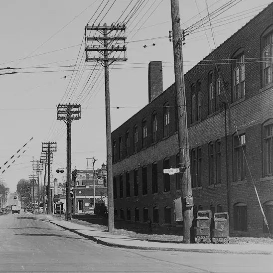
The winning design was manufactured by Rosco Metal & Roofing Products Ltd., a local company whose Toronto facilities were on Dupont Street at Shaw - where a condo now stands. The company had operations across Canada and eventually became Westeel-Rosco Ltd. Beyond that, the paper trail thins out - the specific design decisions that gave the signs their character aren't attributed to anyone on record.
Rosco produced the signs in two lines: a Standard Series, the premium, full-frame assembly built for maximum durability and an Economy Series, a lower-cost variant designed for broader use. By 1948 the signs were being installed at street corners throughout the downtown area, conspicuous on their own metal standards and readable by streetcar riders and motorists alike. The design proved durable enough that it spread well beyond Toronto - the acorn signs were at one time in use in several municipalities across Canada.
For a more thorough documentation of the signs and their variations, TorontoJourney416.com has done the most careful research available anywhere online.
The Signs in Context
For most of the people who walked past them every day, the acorn signs were simply part of the street. Not landmarks, not objects of interest - just information, there when you needed it. You looked up, found the name, kept moving. That was the whole transaction.
That kind of invisibility is what good civic infrastructure achieves. The signs told you where you were without asking for any attention beyond the moment you needed them. They were consistent enough across the city that you stopped seeing them as objects at all - they became part of the background of what a Toronto street corner was supposed to look like.
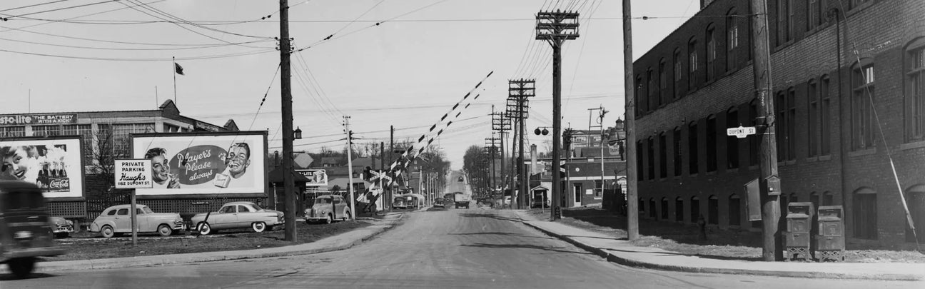
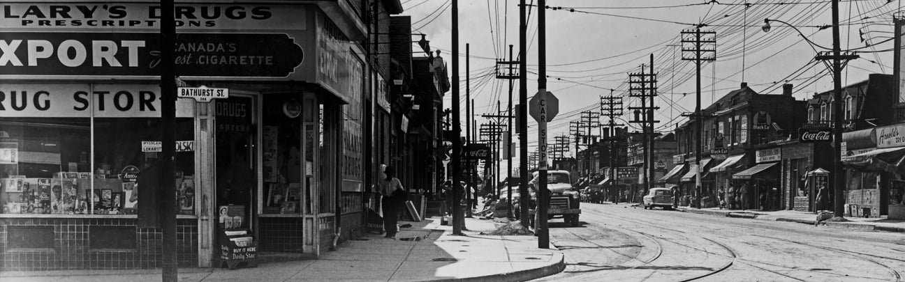
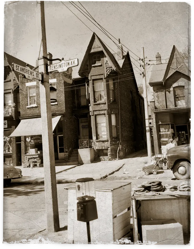
The photos from that era reflect this. The signs appear at the edges of frames, partially obscured by poles and wires, never the subject. The photographers were documenting streets, traffic patterns, development - the signs are incidental. Which is exactly how they were intended to be experienced.
What's changed isn't just the signs themselves. The corners where they stood have changed too - buildings replaced, streets widened, the whole texture of those blocks shifted over seventy years. The new signs are pragmatic and readable. They are also generic in a way the acorn signs never were, because the acorn signs were designed for a specific city at a specific moment, and that specificity is what made them worth noticing once you finally did.
What Survived
Some of the original Rosco signs are still out there. Not many, and fewer every year - but on the streets where they were originally installed, particularly in neighbourhoods that escaped the heaviest redevelopment of the following decades, first-generation acorn signs are still standing at the corners they were installed on seventy-odd years ago.
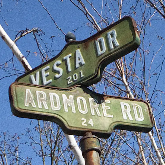
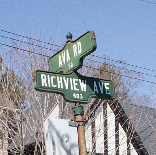
The largest concentration still in active use, at the time of writing, is in Forest Hill - roughly the area bounded by Bathurst Street to the west, Spadina Road to the east, Eglinton Avenue to the north, and St. Clair to the south. The signs here are distinctive: dark forest green backgrounds with white embossed lettering, a colour scheme specific to the neighbourhood rather than the standard black-on-white found elsewhere. Decades of weathering have softened that green to something lighter and rustier, and the white lettering has aged to match - but the form underneath is unchanged. Some of the signs along Bathurst are visibly deteriorating and may not last much longer.
Survivors appear elsewhere too. The Annex and Roncesvalles still have them at scattered intersections. The blocks between Bayview Avenue and Mount Pleasant Road, north of Bloor, have a notable concentration. And Algonquin Island - part of the Toronto Islands - has first-generation signs at its intersections, which feels entirely appropriate for a place that otherwise seems to have stopped changing sometime in the mid-20th century.
Why It Matters
The acorn signs weren't designed to last forever. They were civic infrastructure, practical objects built for a specific purpose. That so many have survived into their eighth decade - still mounted, still legible, still telling people where they are - says something about the particular quality of what Rosco made.
The replacement signs came in two waves. The current blue blade signs are functional and legible. Before them came a flat printed version of the original acorn - same outline, same finial, but the finial itself flattened, the lettering printed rather than embossed, the whole thing bolted through the face to a pole. An attempt to keep the form without understanding what made it worth keeping.
Acorn416 starts from the opposite position: beginning with what made the original worth preserving, and working forward from there.
